Dancestreet is an outstanding dance academy offering a diverse range of classes in Contemporary, Ballet, Tango, Flamenco, Tap dance, and Salsa.
The academy´s skilled instructors are dedicated to nurturing students’ technical abilities, artistic expression, and overall confidence, fostering a love for dance in every individual.
The dance academy is launching its website for two primary reasons. Firstly, it aims to provide valuable information to potential students, thereby attracting new members to its vibrant community. Secondly, the website seeks to enhance the interaction between students and the academy by offering convenient features such as class bookings, access to discounts, and updates on promotions. Through its online platform, the academy endeavors to create a seamless and engaging experience for all its participants.
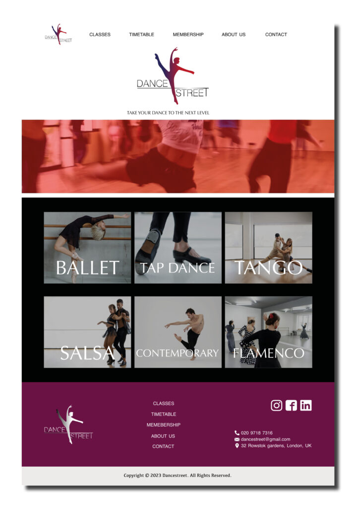
On the home page, you’ll find an array of tools designed to enhance the experience with the website.
Firstly, you’ll notice the school logo prominently displayed, serving as a reassuring marker that the user has arrived at the right destination.
Next, the header guides the user through the various sections of the website, ensuring easy navigation and access to the information the user seek.
Thirdly, I present visually appealing buttons featuring photos representing the diverse dance styles offered by the school. This section is particularly valuable for newcomers, providing insights into the range of styles available for exploration.
Lastly, the footer mirrors the structure of the header, offering a comprehensive overview of the website’s sections. Additionally, it includes essential contact information for the academy along with links to their social media platforms. It’s important to note that this website is crafted with the dual purpose of attracting new students while also prioritizing a seamless user experience for our existing members.
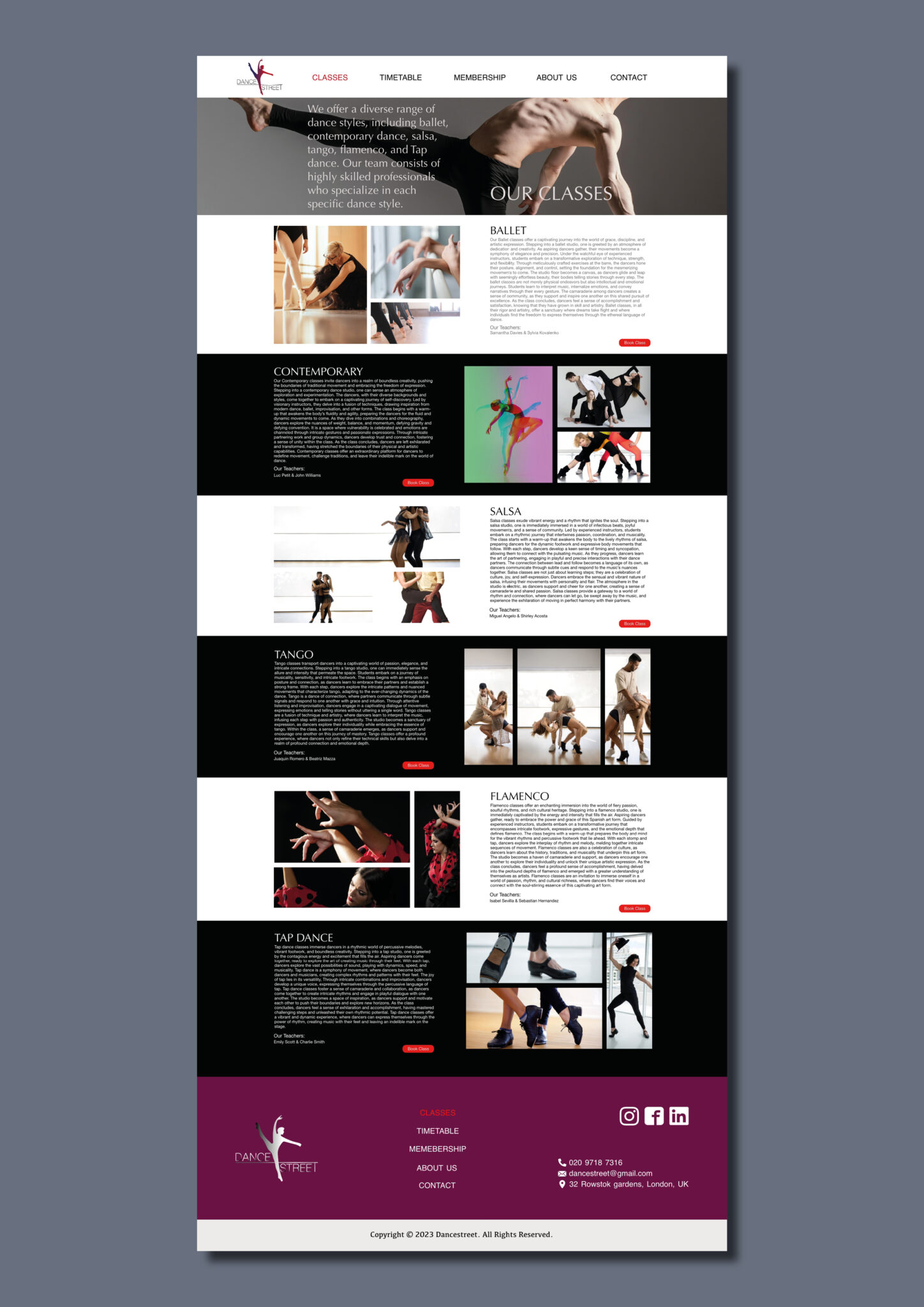
The Classes section serves as a comprehensive guide to the diverse offerings of the academy. Within each subsection, you’ll find detailed information about the classes that the academy offer. To streamline the booking process and minimize distractions, I’ve integrated a convenient “book Class” button alongside each class description. The goal is to furnish users with essential information while facilitating seamless booking experiences with just a single click. By minimizing distractions, I prioritize user convenience, making it effortless to secure a spot at the academy.
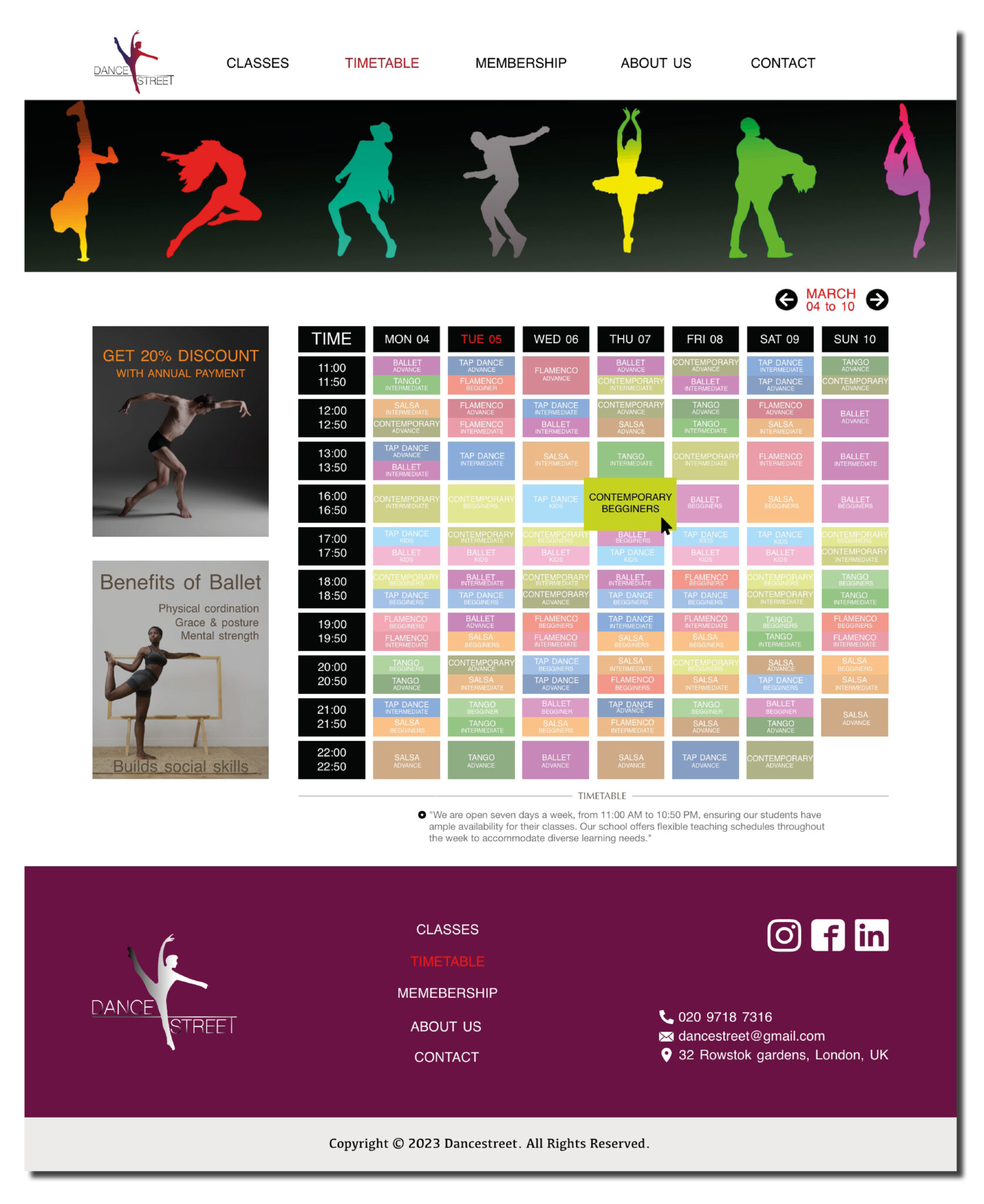
In the Schedule section, I present a comprehensive table detailing the weekly class schedules offered by the academy. This resource serves as an informative guide for students seeking class times that suit their schedules. Within the table, users can easily navigate to specific class hours and reserve their desired time with a simple click. This intuitive tool not only provides valuable information about their class offerings but also empowers users to effortlessly secure their spot in their preferred classes. I strive to enhance the user experience by seamlessly integrating class information with convenient reservation options, ensuring a smooth and efficient booking process for all their students.
At the upper right corner of the schedule table, you’ll find date selection buttons designed for your convenience. Notably, the use of red color highlights the current day, aiding users in orienting themselves within the schedule. Additionally, hovering over a class box triggers an enlargement effect, inviting users to click while providing essential information about the class they are either booking or considering booking. This interactive feature enhances user engagement and facilitates a seamless booking experience, ensuring clarity and ease of use throughout the scheduling process.
For the Dancestreet website, a thoughtfully chosen color palette captures the essence of dance. White and black backgrounds symbolize purity, peace, elegance, mystery, and power, reflecting the artistic expression of dance. A vibrant purple in the footer adds sophistication and creativity, creating a captivating contrast. Passionate red buttons symbolize the energy and exhilaration of dance, inspiring users to embark on their dancing journey.
The carefully curated colors combine to form a visually appealing website that not only represents the art of dance but also engages and captivates visitors, inviting them into the world of Dancestreet.

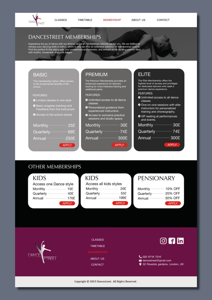
In the Membership section, I outline the various membership packages available at the academy. Three primary packages are showcased: the Basic, Premium and Elite.
The Basic package is highlighted with a clear background, providing concise information about its offerings.
Moving forward, the Premium package boasts additional features, distinguished by a slightly darker background.
At the top tier, the Elite package shines with the most comprehensive features, accentuated by an even darker background. This gradient of backgrounds serves as a strategic marketing tactic, drawing attention to the highlighted package.
To ensure visibility and prominence, I’ve chosen vibrant red buttons for user interactions. Red’s boldness makes it an excellent choice for buttons, guiding users’ attention effectively.
Towards the bottom of the page, I present special membership packages tailored for children and retirees, catering to diverse needs and preferences within their community.
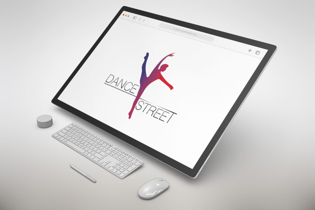
The Dancestreet logo draws inspiration from the elegant movements of a ballet dancer, featuring a wordmark accompanied by a captivating illustration in warm red to deep purple hues with a gradient effect, symbolizing the passion and energy of dance.
The Shree Devanagari 714 font ensures legibility and sophistication, while a gradient effect blending gray with black adds depth and a modern polish. A creative touch elongates the letter “T” in “street,” creating a street-like effect and contributing to the logo’s unique identity. Overall, the Dancestreet logo encapsulates the grace, energy, and urban spirit of the company, leaving a lasting impression and effectively representing the brand’s essence.
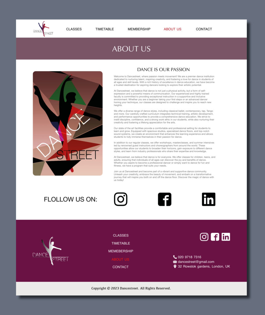
The “About Us” section serves as a platform for the academy to share its rich history, core values, and future aspirations with its audience. It stands as one of the most pivotal sections, offering a compelling narrative to attract new students.
Accompanying the text is an illustration featuring the academy’s logo silhouette set against a backdrop of dynamic triangles in various colors, symbolizing creativity and innovation. This artistic depiction aims to captivate the reader’s attention and inspire them to join to this vibrant community.
In an effort to provide additional resources, I’ve included logos of their social media networks, enabling users to further engage with the academy and stay updated on their latest developments. This strategic inclusion enhances the academy´s online presence and facilitates connections with potential students across various platforms.
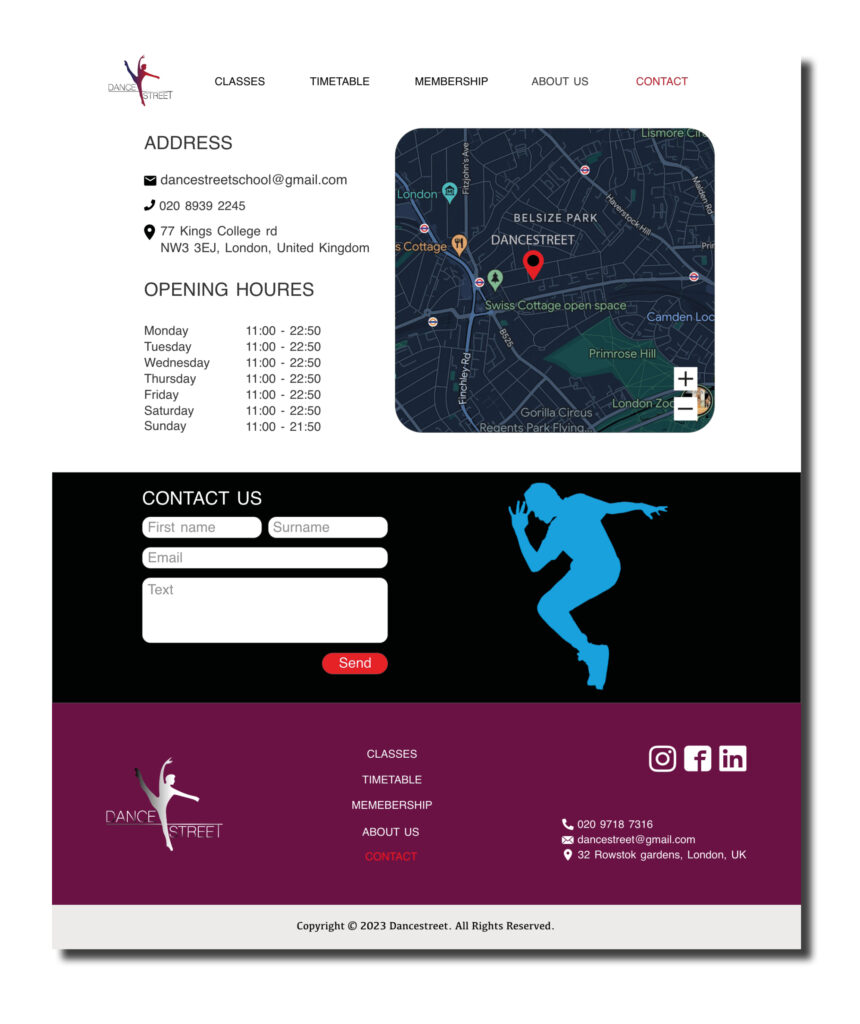
The Contact page stands as a cornerstone of this website, especially given its significance as the virtual gateway to their physical dance academy. Here, visitors can find essential information to facilitate their interactions with the academy.
In this page we find the academy’s email address, telephone number, and physical address. Additionally, I provide details regarding their operating hours, ensuring visitors are well-informed about when they can engage with their services.
Recognizing the importance of location clarity, I’ve integrated a map widget pinpointing the exact address of the academy. Maps offer unparalleled convenience in navigating to a specific destination, and I didn’t want to overlook this invaluable resource.
To enhance user engagement and streamline communication, I’ve incorporated a user-friendly form widget at the bottom of the page. This widget empowers potential clients to reach out, ask questions, and obtain information directly from the website, eliminating the need for additional steps such as composing an email.
By prioritizing user experience and accessibility, the Contact page aims to foster seamless interactions and meaningful connections between the academy and its community.